Template talk:EdNote
Revision as of 03:05, 19 April 2012 by imported>Thirty7 (→Color Choice: +reply)
Color Choice
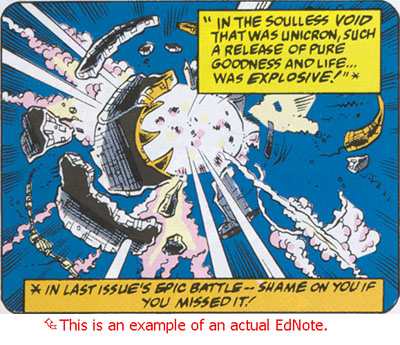
Do you suppose this should be pale green in color instead of hideous yellow to better match the Symbol we use with it? It would still be rather eye-catching, methinks:
—Thirty7 ![]() 18:19, 18 April 2012 (UTC)
18:19, 18 April 2012 (UTC)
- I'm colorblind, but I'm fine with changing it--looks okay to me. I'm not sure I like changing the border to black though. How about this? It's the background color darkened significantly (in HSV, I took V from 100 to 50).
- -- Sekoia 18:58, 18 April 2012 (UTC)
- I didn't care one iota about the border color... I was just too lazy to look up a HEX color that looked right.
 So, that's fine by me. —Thirty7
  20:25, 18 April 2012 (UTC)
- I didn't care one iota about the border color... I was just too lazy to look up a HEX color that looked right.
- Gotta admit I'm a little blinded by the green. When we first talked about the color it was to keep it in a comic book theme. *shrug* -- Blondeshell 21:37, 18 April 2012 (UTC)
- Well, both of them look fine to me, so consider me as having no opinion then. :) -- Sekoia 22:44, 18 April 2012 (UTC)
- Better? Toned it down a bit. I guess I don't really get the yellow box idea from that thread. But, if folks have a strong preference not to make it match, that's cool with me.
- BTW, the rounded corner thing is AWESOME!
- —Thirty7
 23:50, 18 April 2012 (UTC)
 -- Blondeshell 02:37, 19 April 2012 (UTC)
- I don't like the green. At all. EdNotes shouldn't pop out like that, they should moderately blend in. The wiki is about the documentation, not the editor's notes. ~ User:Aggelakis/Sig1 01:47, 19 April 2012 (UTC)
- Are you saying that the green blends in less than the eye-searing yellow it currently is, Agge? Blondeshell: Oddly enough, I never really read many comics. Got into the genre due to all the cartoons in the 90s —Thirty7
 03:05, 19 April 2012 (UTC)
- Are you saying that the green blends in less than the eye-searing yellow it currently is, Agge? Blondeshell: Oddly enough, I never really read many comics. Got into the genre due to all the cartoons in the 90s —Thirty7